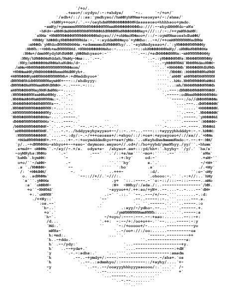
It just seemed wrong to not recognize this fine piece of art since I posted the other font portrait photos. I remember when Pam presented it to Jim as her summer project. How proud she was and she should be. Using plain text as shading and creating something as difficult as a specic face IS something to be proud of. it’s not like there is a shade % chart that covers letters as shades. But looking at the Dwight face made me realize that some people just embrace fonts and Dwight Schrute is no exception. Even though this example was actually done by Pam, I have to point out how natural fonts take to Dwight’s face.
Dwight is actually one of few people that are successful with fonts even though he didn’t specifically set out to be. Look at how relevant his use of Helvetica Bold is in the below birthday banner. “It is your birhtday.” What other font family could state such a fact without an ounce of doubt or fanfare. No one would dare question the reason for the party and definately not when it was bolded. Well done Dwight.

D. Schrute took font usage to a new level when designing Mose’s “FEAR” shirt. Red duct tape spells out F-E-A-R on a shocking non-white background. How clever to use the word as a label since Mose himself is representative of the fear of failure in sales. Kudos for the use of color and creative materials to get the message across.

And lastly, I point out the apex of Dwight’s font expertise with the Schrute Buck. Note the use of specialty fonts. Those aren’t the fonts that are included with Word, he had to find and download those. For as busy as he is as a paper salesman and landlord, I can attest to the fact that finding a font – especially a specific one – to download is no quick task. Those fonts were chosen and placed with care on that fake money.

I click my mouse to Dwight for his command of the font. Keep typing pretty, D.
